Dashboards (Beta)
Warning
The Dashboards page is currently in Beta Mode. Exercise caution and contact the Cirro team with any questions.
The Dashboards page allows you to create ad hoc tables and charts that visualize your data. A dashboard is a page that can hold multiple different plots, like bar or scatter, side by side. Below is a view of an example dashboard.
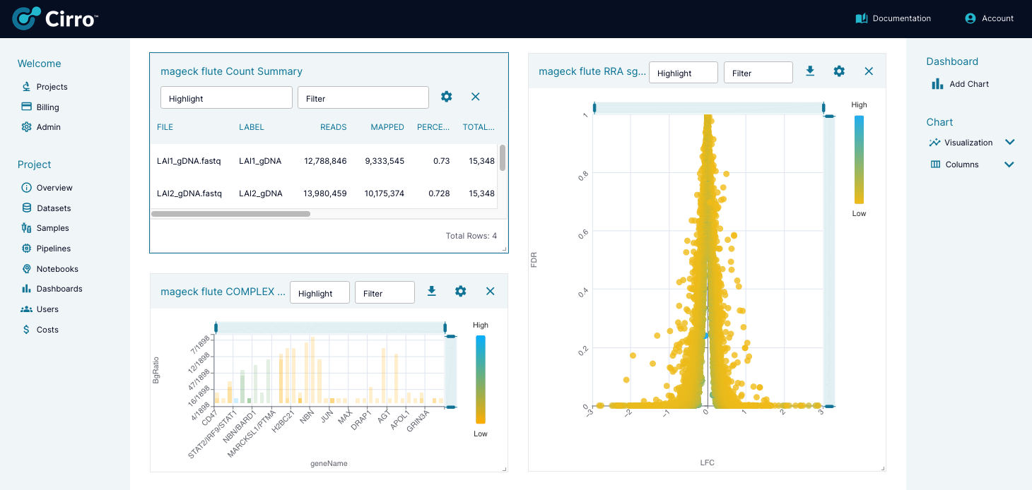
Users can create dashboards for any datasets that have been run through a pipeline and can plot data across multiple datasets.
Adding Charts
To add a chart, click the "Add Chart" button in the right sidebar under "Dashboard".
You will get a pop up of all the possible data sources available that you can create a chart from. Data sources are collections of the data you want to plot. They can be made of a single file from a single dataset, from all the files of one type across all datasets (e.g. all counts files from every MAGeCK Flute dataset in your project), or anything in between.
Select the data source you want to use, or if you do not see it, click the "Create A New Data Source" button. When creating a new data source, you will:
- Select the process of the data you want to chart.
- Select which files from that process you are interested in.
- Select which dataset(s) from that process you want to include. If you're only interested in one dataset you can just select one, or if you want to combine the data from multiple datasets so you can chart them together, you can select multiple datasets here.
From here you can go back to add another data source or continue on to do finer selections on the data source you just created.
You will have the option to then fine tune your data using SQL. Type your SQL commands into the box at the top of the pop up and the click the "Run" button to see how it updates the data table. For example, the command SELECT * FROM tbl_mageck_flute_Counts WHERE GENE = 'A1BG' will filter your tbl_mageck_flute_Counts table to only show where the gene column has a value of A1BG. These SQL edits will apply to the chart you are creating, but will not edit the data source itself. So the next time you select this data source for a chart these SQL commands will not apply. Then click "Next" to load your data source as a chart.
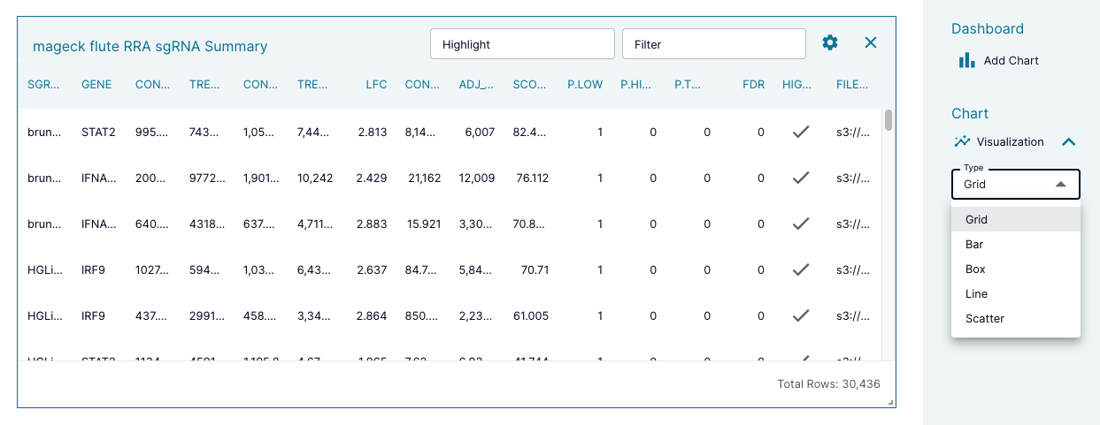
The chart will automatically be created as a table, or "grid", and can be changed to a different chart type by selecting "Visualization" and then "Type" in the right sidebar under "Chart". This will open a drop down menu of all the chart options that are currently available.
Editing and Deleting Charts
Most of the options for changing a chart will be available in the right sidebar under "Chart". There, you can change the type of chart and then change details about the chart including things like columns for the axes, colors for the data, the chart title, legend, and more. We encourage you to play with the options.
You can also use the buttons in the chart's header to do the following:

 Enter a SQL command to highlight the data matching the command.
 Enter a SQL command to filter the data to match the command.
 Click to select the chart to make additional edits in the sidebar. The selected chart will be outlined in blue.
 Download the chart as an SVG file.
 Remove the chart.
As you add more charts, rearrange your charts by dragging the chart's header and change a chart's size by dragging the arrow icon in the bottom right corner of the chart  .
.
Chart Options
Cirro currently has the capability to produce the following charts, with more in development.
- Grid
- Bar
- Box
- Line
- Scatter